Table of Contents
Matching Light Switches with Wall Color: A Guide to Perfect Coordination

Megan Reed |
Matching light switches with wall color might seem like a minor detail in the grand scheme of home design, but trust me, it can make a world of difference. Imagine walking into a room where everything just feels right—the colors harmonize, the textures complement, and even the light switches seem to belong. It’s those little touches that elevate a space from ordinary to extraordinary. So, let’s dive into the art of coordinating light switches with wall colors, and how to create a cohesive look in your home.
The Importance of Coordination
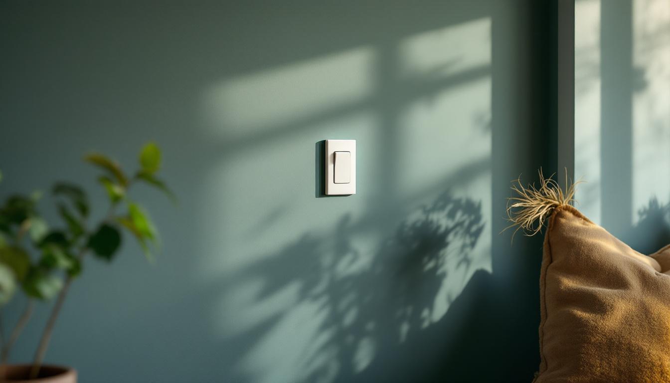
When it comes to interior design, coordination is key. It’s not just about choosing pretty colors; it’s about creating a visual flow that guides the eye and makes a space feel intentional. Light switches, while often overlooked, play a crucial role in this harmony. They’re functional, yes, but they’re also part of the overall aesthetic. Imagine a sleek, modern switch against a vibrant wall—suddenly, it stands out in a way that might not be desirable.
By matching your light switches with your wall color or at least considering their relationship, you can create a seamless transition that enhances the overall design. This doesn’t mean you have to match them exactly, but rather find a balance that feels right. Think of it as a conversation between colors, where each element contributes to a larger narrative.
Understanding Color Theory
Before diving into specifics, let’s touch on some basics of color theory. Colors can evoke emotions and set the tone for a space. Warm colors like reds and yellows can create an inviting atmosphere, while cooler tones like blues and greens tend to be more calming. When selecting light switch colors, consider the mood you want to create in the room.
For instance, if you’re going for a cozy, warm feel in a living room, a soft beige or creamy white switch might complement a warm taupe wall beautifully. On the flip side, if you’re aiming for a more modern, sleek look in a kitchen with cool gray walls, a matte black or brushed nickel switch could add that touch of sophistication.
Additionally, the concept of color harmony can further enhance your design choices. Using analogous colors—those that sit next to each other on the color wheel—can create a serene and cohesive look. For example, pairing a light switch in a soft sage green with a wall painted in a deeper forest green can evoke a sense of tranquility, perfect for a bedroom or study. Understanding how colors interact can elevate your design, making even the smallest elements, like light switches, contribute to the overall ambiance.
Material Matters
Another factor to consider is the material of the light switch. The texture and finish can significantly affect how colors interact. A glossy white switch against a matte wall can create a striking contrast, while a matte switch can blend in more subtly. Think about the overall feel of your space—do you want it to be sleek and modern, or warm and inviting?
For example, if you have a rustic kitchen with wooden cabinetry, a light switch in a warm, aged brass finish can enhance that artisanal feel, echoing the craftsmanship that’s likely present in the rest of the space. This approach aligns beautifully with the values of heritage craftsmanship, where every detail tells a story.
Moreover, the choice of material can also influence the durability and maintenance of your light switches. For high-traffic areas, such as hallways or family rooms, opting for materials that resist fingerprints and smudges, like brushed stainless steel or matte finishes, can keep your design looking fresh and clean. In contrast, in spaces where aesthetics are prioritized over wear and tear, such as a formal dining room, you might choose a more delicate or ornate switch that adds a touch of elegance and sophistication to the atmosphere.
Practical Tips for Matching Light Switches with Wall Colors
Now that we’ve set the stage, let’s get into some practical tips for achieving that perfect coordination between light switches and wall colors.
1. Choose a Dominant Color
Start by identifying the dominant color in your room. This could be the wall color or a prominent feature like cabinetry or furniture. Once you have that, you can select a light switch that either matches or complements this color. For example, if you have a deep navy wall, a light switch in a soft, muted gray can create a beautiful contrast without clashing. Additionally, consider the overall style of your space; a sleek, modern switch may look out of place in a rustic setting, while a vintage-style switch could enhance the charm of a traditional room.
2. Consider the Undertones
Every color has undertones—those subtle hues that can change how a color is perceived. When matching light switches, pay attention to these undertones. A warm beige wall with yellow undertones will look more cohesive with a light switch that has a warm finish, like brass or gold. Conversely, a cool gray wall with blue undertones pairs well with switches in silver or chrome finishes. This attention to detail can elevate the overall aesthetic of your space, making it feel more thoughtfully designed and harmonious.
3. Test Samples
Color can be tricky, and lighting can drastically change how a color appears. Always test samples of your light switches against the wall color before making a final decision. This will give you a better idea of how they interact in different lighting conditions throughout the day. You might find that a switch you thought would look great actually clashes under certain lights. To further refine your choices, consider the texture and finish of the switch; a matte finish may absorb light differently than a glossy one, affecting how the colors appear together.
4. Factor in Room Functionality
When selecting light switches, consider the functionality of the room as well. For example, in a home office or study, you might prefer a more sophisticated look with sleek, minimalistic switches that don’t distract from the overall design. In contrast, a playful color or design might be perfect for a child’s room, where creativity and fun are key. Additionally, think about the type of lighting you’ll be using; dimmer switches can add versatility and ambiance, allowing you to tailor the lighting to different activities throughout the day.
5. Explore Unique Finishes
Don’t shy away from exploring unique finishes that can add character to your space. Textured finishes, such as brushed nickel or matte black, can provide a modern touch, while ornate designs in antique bronze can evoke a sense of nostalgia. These finishes can serve as focal points in your room, drawing the eye and enhancing the overall decor. Furthermore, consider coordinating the switch plates with other hardware in the room, such as door handles or cabinet knobs, to create a cohesive look that ties everything together seamlessly.
Creative Coordination Techniques
Ready to get a bit more creative? Here are some fun techniques to think about when coordinating your light switches with wall colors.
1. Go Monochromatic
For a sleek, modern look, consider a monochromatic scheme. This means using different shades of the same color for both your walls and light switches. For instance, a soft gray wall paired with a slightly darker gray switch can create a sophisticated, layered look that feels cohesive and intentional. To elevate this design choice, you might also explore textures; a matte finish on the wall combined with a glossy switch can add depth and visual interest, making the space feel more inviting.
2. Use Contrast Wisely
While matching is great, sometimes a bit of contrast can add interest. If your walls are a bold color, a light switch in a contrasting hue can serve as a focal point. Just be careful not to overdo it—too much contrast can be jarring. A bright white switch against a deep green wall can pop beautifully without overwhelming the space. Additionally, consider the shape and style of the switch itself; a sleek, modern switch can enhance the contemporary feel of a bold color scheme, while a vintage-style switch might complement a more eclectic or traditional aesthetic.
3. Incorporate Patterns
If you’re feeling adventurous, think about incorporating patterns. This could be through decorative light switch covers that echo a pattern in your wallpaper or textiles. It’s a subtle way to tie in other design elements and create a more dynamic space. For example, if your room features a floral wallpaper, a light switch cover with a similar floral motif can create a harmonious flow. You might also consider using removable wallpaper or decals on your switch covers, allowing for easy updates as your style evolves or as trends change.
Final Thoughts
Matching light switches with wall colors is all about creating a harmonious balance that enhances the overall design of your space. It’s those thoughtful details that can elevate a room from ordinary to extraordinary. Whether you choose to match, contrast, or incorporate creative elements, the key is to ensure that every piece works together to tell a cohesive story.
So, the next time you’re planning a room makeover or just looking to refresh your space, don’t overlook those light switches. They might be small, but they play a big role in the overall aesthetic. With a little thought and creativity, you can ensure that every detail, right down to the switches, contributes to the beautiful narrative of your home.
Illuminate Your Historical Home with Elegance
At Residence Supply, we understand that the perfect coordination of light switches and wall colors is crucial for the sophisticated ambiance of your historical home. Our handcrafted fixtures are more than just lighting solutions; they are timeless pieces that complement your decor and honor the craftsmanship of old-world artisans. From elegant chandeliers to bespoke light switches, each piece in our collection promises to enhance the narrative of your space with its unique artistry and functionality. Shop Now and let us help you bring a touch of tradition and elegance to your home.