The Gray Decade
For about ten years, we've painted houses here in America as if we were trying not to get caught doing something, or living in a way we weren't supposed to.
There was gray, soft gray, warm gray, cool gray, a gray with a little beige in it, then a beige with all its blood drained out. And the names were always evasive, some form of mist, fog, drift, whisper, pale oak, agreeable this, classic that. All of them sounded like they were given by someone trying too hard to be esoteric, or by someone trying to slowly back out of a room.
Nobody chooses gray because they love gray.
Nobody stood in front of a freshly painted wall of Agreeable Gray and became more alive, or felt more seen. People chose gray because they chose to behave and to blend in. Gray photographed cleanly, and it made a house easier to sell. Why struggle to express your life through your home when you can pass that off to someone else to figure out when they move in?
The "gray room" was a sales strategy with a sofa in it, not a room. Its whole existence was predicated on the listing photo, the appraisal, the algorithm, the Sunday open house, the imaginary couple walking through, and trying to picture their own furniture where yours currently sits.
This was the great interior bargain of the 2010s, "Erase yourself now, profit later."
The Paint Industry Is Forecasting a Warmer Future
But the paint aisle is telling a different story now. Not loudly because paint cans can't do anything loudly. But a paint can does a great job of pretending to be a decorating decision when it's really a psychological report on the state of interiors. And the report is clear, the most popular colors in America have turned warm. That turn is one of the clearest signals we have about where interiors, and the people creating them, are heading.
Look at what the brands forecast for 2026, and the shift in temperature is unmistakable. Sherwin-Williams went to a warm, mushroom-toned greige it named Universal Khaki. Benjamin Moore moved all the way into espresso brown with Silhouette. Valspar reached for a warmer eucalyptus, Glidden for a red mahogany, and Farrow & Ball for a peachy terracotta. A forecast is more corporate astrology than fact; it's a brand telling you what it expects the future to look like. But if we read these particular stars, they all say the same thing: people want heat, weight, depth, and evidence of longevity.
And the cold sales numbers say it too. On Sherwin-Williams' own most-popular list, the warmer colors have bumped Agreeable Gray, the polite tyrant of the last decade, out of first place. Raw gallons by color stay mostly proprietary, and what floats around publicly is often unreliable, but what we have is enough for a diagnosis.
Our diagnosis is that warmth is the new neutral. And the most telling part is that the brands can't agree on which warm. Sherwin-Williams says mushroom-khaki, Benjamin Moore says brown, Behr says smoky jade, Valspar says eucalyptus, Farrow & Ball says terracotta. Pantone, perversely, went the other way entirely and named a white, "Cloud Dancer," though this is the same Pantone that spent all of last year inside a cup of Mocha Mousse. Even the outlier proves the point. There is no single consensus color this year, which means there is no one color left to hide behind.
Why Warmth Is Replacing Gray
For years, that color was gray. If you didn't know what you wanted, you painted the wall gray. If you were afraid of choosing wrong, you painted the wall gray. If you were selling, staging, flipping, renting, photographing, optimizing, or simply trying to avoid the embarrassment of having your taste judged, you painted the wall gray.
Now there is no safe answer.
No consensus means you have to admit to wanting something and open yourself up for that desire to be either received or rejected by those who enter your home.
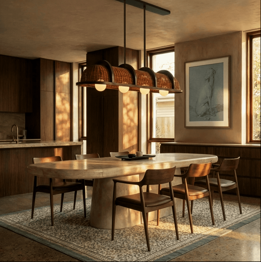
That's why this warmth is so interesting. It's deeper, stranger, more atmospheric. Colors like Rust, Petrol, Moss, Plum, Espresso, Ochre, Olive, Mushroom, Terracotta, these are not background colors, and they do not disappear politely into a real-estate photo. They are intentional, and they come with consequences.
The red herring will have you thinking these colors are in opposition to gray, when the truth is they're in opposition to vacancy.
The New Colors of Conviction

Rust
We like rust because it brings age into a space before anything has had time to age. It suggests clay, iron, old tile, cooked tomato, tobacco, the inside of a bar you shouldn't enter before five, or a restaurant you walk into just as the sun is setting. Rust is warm but not sweet; it has rough hands and a little dirt under its nails from experience.

Moss
Moss is quieter, but not weaker. It grounds a room the way green always has when it's allowed to grow up beyond just "green." It's not the cheerful houseplant green, but green in the older, shaded-garden way, the stone-wall-with-water-on-it way. Moss makes a room feel settled in to, as if what's there has been there longer than the people moving through it.

Petrol
Petrol is our argument against the idea that warmth must always come from red, yellow, or brown. Petrol is cool by family but warm by behavior. It has blue in it, green in it, depth and shadow in it. It makes a room cinematic without making it theatrical. It pulls you in because it has the decency to withhold a little something to mystery and gives you a reason to linger.

Plum
Plum is the most seductive one. Deep, moody, a little decadent. It carries associations people understand before they can explain them: velvet, wine, bruised fruit, intimate rooms, low light, a refusal to be casual. Used poorly, it collapses into drama. Used well, it gives a room gravity.
These are atmospheres makers, not accent colors. They are room-setters that have already decided what kind of experience they want to have, by day or by night.
The Problem Was Never Gray
It would be lazy to just say "gray is over," because it's not. No profitable color ever dies. It just gets renamed, reformulated, and rented to developers until taste finds another way around it. There are beautiful gray rooms, gray stones, gray skies, gray linens, gray-green shutters on houses that make you feel like you could have a home-cooked meal there.
The problem was never gray itself. The problem was what gray came to represent: an exit strategy, a room edited in advance for someone who didn't live there. A gray wall could be elegant. But for the past few years, most weren't. They were proof of fear and we have the feed to thank for making cowards of us for a while.
Our posts became so formulaic that they taught people to design for the image before the experience. A room had to be bright, flattened, scroll-proof, instantly understandable. Any color in the frame had to recede, flatter the algorithm, do its job, and shut up.
Colors like Rust, Moss, Plum, and Petrol don't shut up. Rust changes the way wood reads. Moss changes the way brass behaves. Petrol makes celebrities of shadows. Plum turns a corner into an invitation. Brown brings weight. Mushroom softens and leaves room for you to exhale. Terracotta gives plaster, linen, stone, and ceramic someone to talk to. These colors make other materials more themselves and set a stage for them to perform at their highest levels.
That matters because interiors are moving toward material honesty again. People want less surface perfection and more patina, more visible grain, more aged metal, dark wood, textured plaster, stone with movement, fabric with body, they want rooms that know the difference between considered and creatively castrated. Warmth is part of that, but it isn't only chromatic, it's tactile, historical, and emotional. A warm room says something happened here before you arrived, and something can happen here after.
Neutral No Longer Means Invisible

That's why color-drenching has become so important. Walls, trim, built-ins, ceiling all one tone, all of it makes sense now. If the room has a point of view, why interrupt it every twelve inches with white trim? Why pretend the ceiling isn't part of the room? Why paint one timid accent wall, like you're a person asking permission to have a personality?
The best interiors have always understood that neutrality doesn't mean absence. A good neutral isn't blank; it's generous. It gives the life inside the room somewhere to land. That's why these new colors can behave like neutrals even when they're saturated. Moss can be neutral because it steadies. Petrol because it deepens. Rust because it warms every material around it. Plum because it absorbs light and gives the room a center of gravity. Neutrality is no longer about disappearing, it's about holding space now.
That's the most important shift in taste right now.
For a long time, "safe" meant empty, pale, and resale-ready. It was the house you could mentally move out of before you'd moved in. Now safe can mean a room that feels resolved, choices that follow a logic, someone who didn't panic halfway through and retreat to builder white or don't judge me gray.
Why Conviction Is the New Safe Choice
The paint can has always been one of the most democratic objects in design. Most people will never buy the Italian sofa, the antique marble sink, the hand-cast bronze door, the 18th-century mirror with the perfect amount of decay. But they will buy a gallon of paint. They'll stand under fluorescent hardware-store lighting on a random Saturday morning, have their phone ready to tap, and decide what kind of room they're willing to live with.
That's a big decision.
A few years ago, it said, "How can I make it easy to leave."
Now it says, "How can I make it worth staying."
Warmth is the new neutral because people are no longer asking color to disappear on their behalf. They're asking for depth, memory, appetite, patina, some shadow play. They want a little risk; a little evidence that they were here, they lived, they loved (bonus points if you get the reference). People no longer believe you can get that from a gray wall.
The gray wall was an "eh" with a shrug.
The warm wall is the new signature.